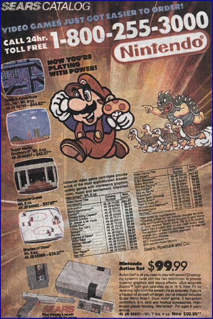
Meri is digging through some old X-Men comic issues right now, and showed me a hilarious advertisement for Sears, and specifically their Nintendo inventory. Check this out from The Uncanny X-Men issue 247 from 1989:

The first thing we noticed was the swapped screenshots for Zelda II and Castlevania II. It also lists Super Mario Bros. II and shows a screenshot from the first game (and clearly from 1-1 of SMB1, and not the Japanese SMB2).
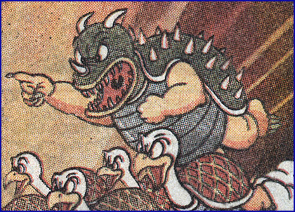
What really got me though was the representation of Bowser, King of the Koopas. Take another look at him:

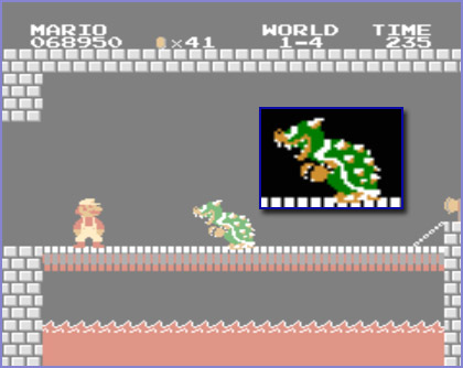
He is really freakin’ scary, there. The thing is, it’s not all that far removed from how he is actually represented in the first Super Mario Bros.:

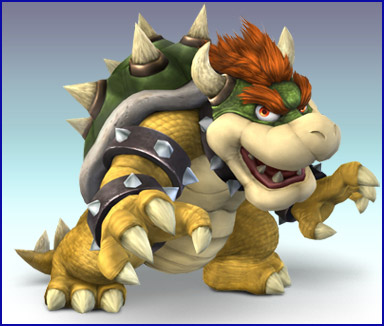
He was very clearly more “dinosaur”-inspired in the 1980s, and a rather frightening turtle-dinosaur-monster-man-thing at that. To today’s crowd, he’s almost unrecognizable in this original form. Bowser has become a rather sympathetic character over the years. Between his bumbling ways in the American cartoons, his constant team-ups in the Mario RPG series, collaborative sports events with the heroes… even when he is being evil, he’s a very lovable evil monster. Take a look at a modern representation of Bowser from Super Smash Bros. Brawl:

He is much more rounded-off, has more color to him (remember, “bright” = “nice”, and “dark” = “evil”…!), smiles a lot more… you just want to reach over and hug him!
As you can tell, I do not have a whole lot of commentary to add; I mostly just find it fascinating how characters change and evolve over time (both in- and out-of game), and wanted to share!


This ad actually pops up on eBay from time to time…
Speaking of this early Bowser design, it also popped up (or maybe even originated?) in the first Super Mario Bros strategy guide. You will notice everyone here looks almost nothing like they do today (well, maybe Mario does). Another odd thing… the King shown in this guide looks a lot like the King from the Valiant comic series (of SMB). Cool.
http://www.flickr.com/photos/39146331@N06/3639205269/sizes/l/in/set-72157619943786198/
I love the oldschool Bowser/Koopa. I remember the PAL manual from SMB1. There was a similar illustration of him.
The true answer…
Bowser’s the greatest Nintendo character of ALL TIME. GOOD DAY.
All I can think to say is that Bowser looks really “naked” without the arm bands in that old illustration.
Dr. Robotnik has taken a similar arc as a sympathetic villian. It seems that in order for a video game villian to last, they can’t be pure evil.
Ha, I never saw that old art of Bowser before, talk about a transformation! I admit to preferring his newer design, but he still seems like he could be a very menacing character (not a lot has changed other than his color scheme for me). In Galaxy he proved to be an actual threat, and not a joke character. The only times he’s really been made to look more like a joke or a weaker character, that I’ve noticed anyway, were in the various RPG games (“Paper Mario and the Thousand-Year Door” and “Mario and Luigi: Superstar Saga” stand out to me) and possibly in the Brawl story mode (where he gets bossed around, albeit only through gesture, by Ganondorf).